The topics in this section describe how to customize the appearance of a dashboard or any of its elements using conditional formatting and coloring.
Conditional Formatting
The Dashboard Designer provides the capability to apply formatting to dashboard item elements whose values meet the specified condition. This feature allows you to highlight specific elements using a predefined set of rules.
Conditional Formatting Overview
Comparison rules used in conditional formatting can be divided into the following groups.
-
Value :Allows you to compare static values (such as Greater Than, Less Than, Between, etc.).
-
Top-Bottom: Highlights a specific number of topmost/bottommost values.
-
Average: Highlights values above the average value or below the average value.
-
A Date Occurring: Allows you to highlight date-time values that fall into a specified interval.
-
Expression: Allows you to use complex conditions to apply formatting. You can also pass dashboard parameters to expressions.
-
Icon Ranges: Allows you to apply formatting by displaying specific icons for different ranges of values. You can select a predefined set of icons or use a specific icon for each range.
-
Color Ranges: Allows you to apply formatting using specific colors for different ranges of values. You can select a predefined set of colors or use custom appearance settings to highlight values within specified ranges.
-
Gradient Ranges: Allows you to apply formatting using gradient color scales.
-
Bar: Allows you to visualize numeric values using bars. You can also color bars corresponding to positive and negative values using different colors.
-
Bar Color Ranges: Allows you to visualize numeric values using bars whose colors are contained in the specified color set.
-
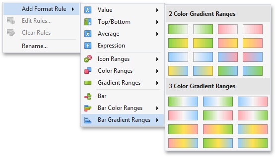
Bar Gradient Ranges: Allows you to visualize numeric values using bars whose colors are contained in the specified color gradient.
You can create comparison rules for measures or dimensions. The list below shows format conditions that can be applied to different types of Data Items.
-
Measure/numeric
-
Dimension Value
-
Top-Bottom Average
-
Expression
-
Icon Ranges
-
Color Ranges
-
Gradient Ranges
-
Bar
-
Bar Color Ranges
-
Bar Gradient Ranges
-
String Dimension
-
Value with the condition type set to Equal To, Not Equal To or Text that Contains Expression
-
Date-Time
-
Dimension Value
-
A Date Occuring for dimensions with the continuous date-time group interval Expression
-
Icon Ranges
-
Color Ranges
-
Gradient Ranges Bar
-
Bar Color Ranges
-
Bar Gradient Ranges
Create a Format Rule
To create a new rule used to apply formatting according to the required condition, do the following:
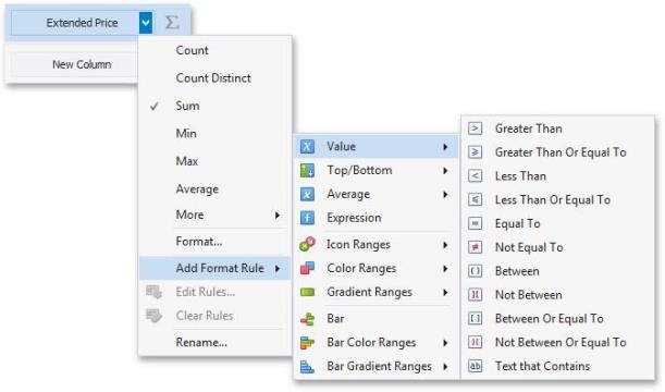
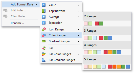
- Choose a measure/dimension by whose values a format condition will be calculated. Click the measure/ dimension menu button, select Add Format Rule and choose the condition.
-
This invokes the dialog that depends on the selected format condition and the type of dashboard item. For instance, the image below displays the Greater Than dialog corresponding to the Value format condition for the Grid dashboard item.
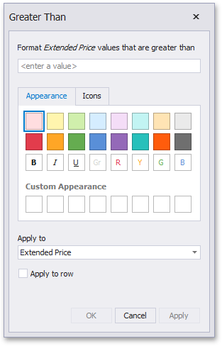
In this dialog, specify settings for the selected condition (for instance, specify a value to compare with dimension/measure values). To learn more, see the documentation for the required condition.
-
Specify appearance settings applied to elements whose values meet the noted condition.
-
Specify the data item to whose values conditional formatting is applied using the Apply to combo box.
Thus, you can create a format rule for one data item and apply new appearance settings to the other data item. You can also create format rules for hidden measures and apply formatting to values of visible Data Items. Different dashboard items can provide additional capabilities for creating a new format rule. To learn more, refer to documentation for the required dashboard item.
Specify Appearance Settings
When creating a new format rule, you can select the required appearance settings applied according to the current format condition. All format conditions allow you to customize appearance settings in a similar manner. For instance, the Value format condition allows you to specify appearance settings in the following way:
The Appearance tab allows you to choose the predefined background color/font.
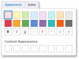
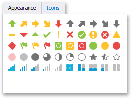
The Icons tab allows you to add the predefined icon.
Use the Custom Appearance area in the Appearance tab to add presets containing custom appearance settings. To add a new preset, click an empty square. This invokes the Custom Style Settings dialog, allowing you to specify the required appearance settings.
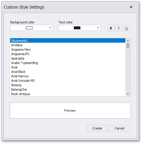
In this dialog, you can specify the backgoround/foreground colors and font settings. Click Create to add a preset. The created preset will be displayed in the Custom Appearance area.
Edit a Format Rule
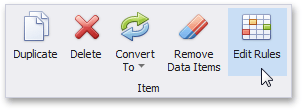
To edit format rules for the selected dashboard item, click the Edit Rules button in the Home ribbon tab.
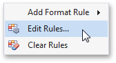
As an alternative, use the Edit Rules data item's menu item or the corresponding item in the dashboard item's context menu.
This invokes the Edit Rules dialog containing existing format rules for this dashboard item.
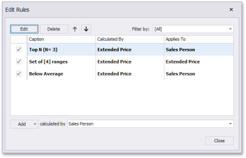
This dialog allows you to perform the following actions:
-
To edit the selected rule, use the Edit button or double-click the required rule.
-
To delete the selected rule, use the Delete button.
-
To reorder format rules, use the Up and Down buttons (the and icon, respectively). Reordering of rules allows you to specify the priority of rules from higher (a bottommost rule) to lower (a topmost rule).
-
To enable/disable the required rule, use the corresponding check box on the left column.
-
To create a new rule, click the Add button and select the required format condition. The Calculated By combo box allows you to select the measure/dimension by whose values a format rule is applied.
-
To filter format rules by the specified data item, use the Filter by combo box.
To clear all rules for the specified data item, use the Clear Rules button in the data item's context menu.
Value
The Value format condition allows you to compare static values (such as Greater Than, Less Than, Between, etc.). The following condition types are supported for measures or date-time dimensions:
Greater Than/Greater Than or Equal To
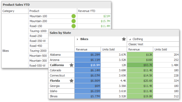
The "Greater Than"/"Greater Than or Equal To" format conditions allow you to apply formatting to elements whose values are greater than/greater than or equal to the specified value. For instance, the following image displays a Grid dashboard item whose Exten ded Price cells are filled in green if their values are Greater Than 150 000.
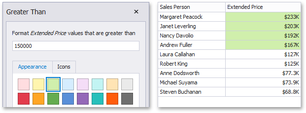
This format condition can be applied to measures or date-time dimensions.
Less Than/Less Than or Equal To
The "Less Than"/"Less Than or Equal To" format conditions allow you to apply formatting to elements whose values are less than/less than or equal to the specified value. For instance, the following image displays a Grid dashboard item whose E xten ded Price cells are filled in red if their values are Less Than 150 000.
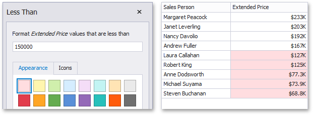
This format condition can be applied to measures or date-time dimensions.
Equal To/Not Equal To
The "Equal To"/"Not Equal To" format conditions allow you to apply formatting to elements whose values are equal to/not equal to the specified value. For instance, the following image displays a Grid dashboard item whose Sales Pers on cells are filled in blue if their values are equal to 'Robert King'.
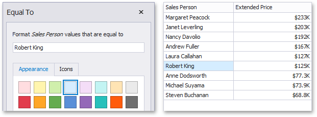
This format condition can be applied to measures, string or date-time dimensions.
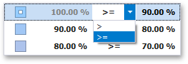
Between/Not Between
The "Between"/"Not Between" format conditions allow you to apply formatting to elements whose values are between/not between the specified values. For instance, the following image displays a Grid dashboard item whose Extended Price cells are filled in orange if their values are Between 100,000 and 200,000.
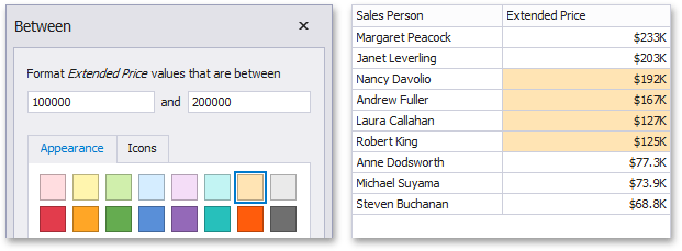
This format condition can be applied to measures or date-time dimensions.
The "Text That Contains" format condition allows you to apply formatting to elements whose values contain the specified text. For instance, the following image displays a Grid dashboard item whose Sales Person cells are in cyan if their values contain the 'An' text.
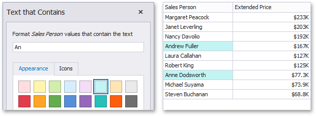
This format condition can be applied to measures, string or date-time dimensions.
Top-Bottom
The Top-Bottom format conditions allow you to highlight a specific number of topmost/bottommost values. You can specify this number as an absolute or percent value.
The following condition types are supported for measures:
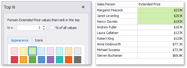
Top N
The "Top N" format condition allows you to apply formatting to elements whose values are ranked at the top. For instance, the following image displays a Grid dashboard item whose top 3 Extended Price values filled in green.
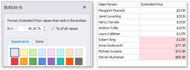
Bottom N
The "Bottom N" format condition allows you to apply formatting to elements whose values are ranked at the bottom. For instance, the following image displays a Grid dashboard item whose bottom 40%Extended Price values are filled in red.
Average
The Average format conditions allow you to highlight values above or below an average value. The following condition types are supported for measures:
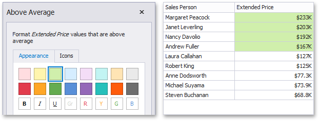
Above Average/Above of Equal Average
The "Above Average"/"Above or Equal Average" format conditions allow you to apply formatting to elements whose values are above/above or equal to the average. For instance, the following image displays a Grid dashboard item whose Extended Price values that are above average (~ 141,000) filled in green.
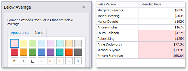
Below Average/Below or Equal Average
The "Below Average"/"Below or Equal Average" format conditions allow you to apply formatting to elements whose values are below/below or equal to the average. For instance, the following image displays a Grid dashboard item whose E xten ded Price values that are below average (~ 141,000) filled in red.
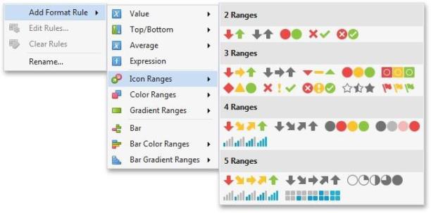
Icon Ranges
Icon Ranges allow you to use predefined or custom sets of icons to apply conditional formatting to different ranges of values.
To format values according the required condition, click the data item menu button, select Add Format Rule | Icon Ranges and choose the required icon set.
This invokes the Range Set dialog containing the set of value ranges and corresponding icons. The Grid dashboard item on the right displays the default formatting applied using the predefined set of 3 icons.
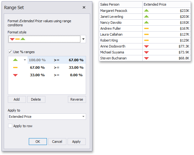
This dialog allows you to change the following options specific to Icon Ranges.
-
The Format Style combo box allows you to change the icon set used to apply formatting.
-
The Use % ranges check box specifies whether the percent or absolute scale is used to generate ranges.
Note that this option is not available for date-time dimensions.
To change the icon displayed for values corresponding to the specified range, click the button next to the required icon and select a new icon.
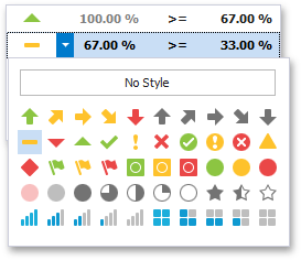
Select No Style to disable the indication for the required range.
You can change range boundaries by specifying the required values.
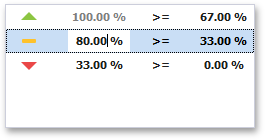
Note that a new value should fall into a range between corresponding values of the previous and next range.
To change the comparison logic for the required range, click the comparison sign and select the required option.
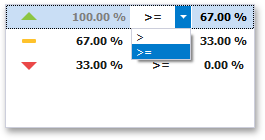
The greater or equal sign includes the smallest value of the current interval while the greater sigh excludes the smallest value from the current interval and includes it in the next interval.
Use the Add and Delete buttons to add new ranges or delete the selected range respectively. Note that new range is added below the selected range.
Color Ranges
Color Ranges allow you to use predefined sets of colors to apply conditional formatting to different ranges of values. You can also use custom appearance settings for specific ranges.
To format values according the required condition, click the data item menu button, select Add Format Rule | Color Ranges and choose the required icon set.
This invokes the Range Set dialog containing the set of value ranges and corresponding appearance settings. The Grid dashboard item on the right displays the default formatting applied using the predefined set of 3 colors.
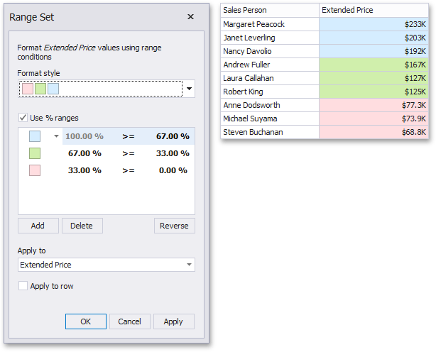
This dialog allows you to change the following options specific to Icon Ranges.
-
The Format Style combo box allows you to change the color set used to apply formatting.
-
The Use % ranges check box specifies whether the percent or absolute scale is used to generate ranges.
Note that this option is not available for date-time dimensions.
To change the appearance settings applied to values corresponding to the specified range, click the button next to the required color and select a new color or specify custom appearance settings.
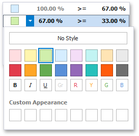
Select No Style to disable the indication for the required range.
You can change range boundaries by specifying the required values.
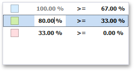
Note that a new value should fall into a range between corresponding values of the previous and next range.
To change the comparison logic for the required range, click the comparison sign and select the required option.
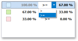
The greater or equal sign includes the smallest value for the current interval while the greater sign excludes the smallest value from the current interval and includes it in the next interval.
Use the Add and Delete buttons to add new ranges or delete the selected range respectively.
Gradient Ranges
Gradient Ranges allow you to use predefined color gradients to apply conditional formatting to different ranges of values. You can also use specific colors to generate custom gradients.
To format values according the required condition, click the measure menu button, select Add Format Rule | Color Ranges and choose the required color gradient.
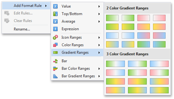
This invokes the Gradient Ranges dialog containing the set of value ranges and corresponding appearance settings. The Grid dashboard item on the right displays the default formatting applied using the predefined Red- Blue gradient.
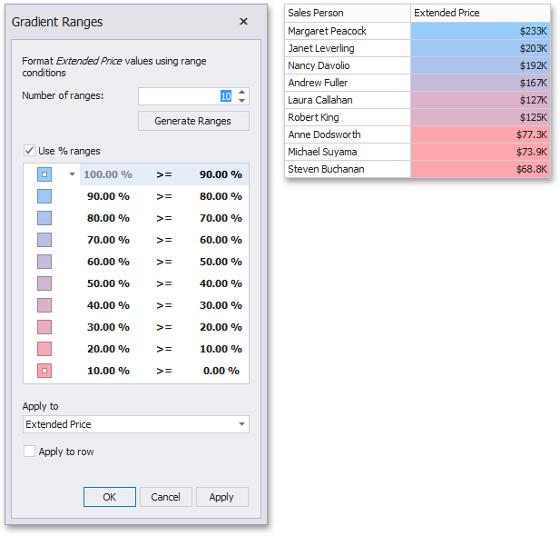
This dialog allows you to change the following options specific to Gradient Ranges.
-
Number of ranges allows you to specify the number of ranges used to classify values.
-
Click the Generate Ranges button to generate a new gradient scale according to the specified number of ranges. The Use % ranges check box specifies whether the percent or absolute scale is used to generate ranges.
Note that this option is not available for date-time dimensions.
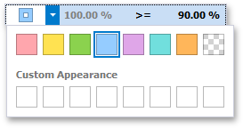
To change the specific color in the gradient, click the button next to the required color and select a new color or specify a custom background color. This allows you to create a color gradient based on more than two colors. In this case, the specified colors are marked with an empty square.
You can change range boundaries by specifying the required values.
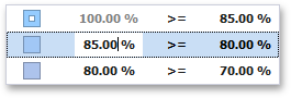
Note that a new value should fall into a range between corresponding values of the previous and next range.
To change the comparison logic for the required range, click the comparison sign and select the required option.
The greater or equal sign includes the smallest value in the current interval while the greater sign excludes the smallest value from the current interval and includes it in the next interval.
A Date Occurring
A Date Occurring format condition allows you to highlight date-time values that fall into a specified interval. Note that this format condition can be applied to dimensions with the continuous date-time group interval.
To format values according the Date Occurring condition, click the menu button of the required dimension and select Add Format Rule | A Date Occurring.
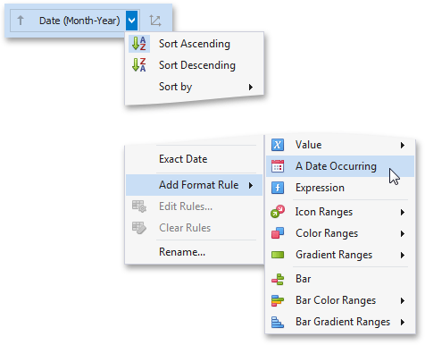
This invokes the A Date Occurring dialog which allows you to select a date-time interval(s), whose value should be formatted.
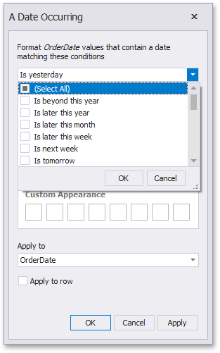
The following intervals are supported:
-
Is beyond this year - Dates that follow the current year.
-
Is later this year - Dates of the current year starting from the following month.
-
Is later this month - Dates of the current month that follow the next week.
-
Is later this week - Dates of the current week starting from the day after tomorrow.
-
Is next week - Dates that belong to the following week.
-
Is tomorrow - Tomorrow.
-
Is today - Today.
-
Is yesterday - Yesterday.
-
Is earlier this week - Dates of the current week that are prior to yesterday.
-
Is last week - Dates of the previous week.
-
Is earlier this month - Dates of the current month that are prior to the previous week.
-
Is earlier this year - Dates of the current year that are prior to the current month.
-
Is prior to this year - Dates that are prior to the current year.
-
Empty - Does not specify any condition.
-
Beyond - Dates that belong to the month in three-months time and beyond.
-
ThisWeek - Dates that belong to the current week.
-
ThisMonth - Dates that belong to the current month.
-
MonthAfter1 - Dates that belong to the following month.
-
MonthAfter2 - Dates that belong to the month in two-months time.
-
MonthAgo1 - Dates that belong to the previous month.
-
MonthAgo2 - Dates that belong to the month two months ago.
-
MonthAgo3 - Dates that belong to the month three months ago.
-
MonthAgo4 - Dates that belong to the month four months ago.
-
MonthAgo5 - Dates that belong to the month five months ago.
-
MonthAgo6 - Dates that belong to the month six months ago.
-
Earlier - Dates that belong to the month seven months ago and earlier.
Expression
An Expression format condition allows you to use complex conditions to apply formatting.
To format values according to the Expression condition, click the menu button of the required data item and select.
Add Format Rule/Expression

This invokes the Expression dialog that allows you to specify the required expression. For instance, the following image displays a Grid dashboard item whose rows are filled in green if the Extended Price/Quantity values are greater than 150,000 and 7,500, respectively.
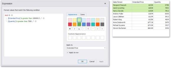
You can pass static values when creating conditions or pass a dashboard parameter to apply conditional formatting dynamically.
Bar
The Bar format condition allows you to visualize numeric values using bars. You can also paint bars corresponding to positive and negative values using different colors.
To format values according to the Bar condition, click the menu button of the required data item and select Add Format Rule | Bar.

This invokes the Bar dialog that allows you to specify the required settings. For instance, the following image displays a Grid dashboard item whose Extended Price cell contains data bars corresponding to numeric values.
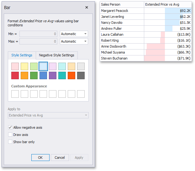
This dialog allows you to change the following options specific to the Bar format condition:
-
By default, lengths of the shortest and longest bars correspond to minimum and maximum values, respectively. If necessary, you can specify values corresponding to the shortest and longest bars manually. To do this, change the type of minimum/maximum value from Automatic to Number or Percent, and specify the required values.
-
Style Settings and Negative Style Settings allow you to specify style settings used to color data bars corresponding to positive and negative values, respectively. To learn how to specify custom style settings, see the Specify Appearance Settings paragraph in the Conditional Formatting topic.
-
The Allow negative axis option allows you to specify whether negative data bars are displayed in the direction opposite to the positive data bars.
-
The Draw axis option specifies whether to draw the vertical axis between positive and negative data bars.
-
The Show bar only option specifies whether to show bars without corresponding values.
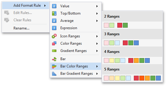
Bar Color Ranges
Bar Color Ranges allow you to visualize numeric values using bars whose colors are contained in the specified color set.
To format values according the required condition, click the data item menu button, select Add Format Rule | Bar Color Ranges and choose the required color set.
This invokes the Color Range Bar dialog containing the set of value ranges and corresponding colors. The Grid dashboard item on the right displays the default formatting applied using the predefined set of 3 colors.
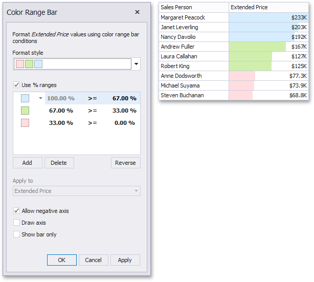
This dialog allows you to change the following options specific to Bar Color Ranges.
-
The Format Style combo box allows you to change the color set used to apply formatting.
-
The Use % ranges check box specifies whether the percent or absolute scale is used to generate ranges.
Note that this option is not available for numeric dimensions.
To change the appearance settings applied to values corresponding to the specified range, click the button next to the required color and select a new color or specify custom appearance settings.
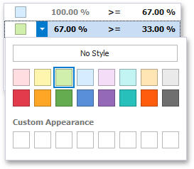
Select No Style to disable the indication for the required range.
You can change range boundaries by specifying the required values.
Note that a new value should fall into a range between corresponding values of the previous and next range.
To change the comparison logic for the required range, click the comparison sign and select the required option.
The greater or equal sign includes the smallest value for the current interval, while the greater sign excludes the smallest value from the current interval and includes it in the next interval.
Use the Add and Delete buttons to add new ranges or delete the selected range respectively.
Bar Gradient Ranges
The Bar Gradient Ranges allow you to visualize numeric values using bars whose colors are contained in the specified color gradient.
To format values according the required condition, click the measure menu button, select Add Format Rule | Bar Gradient Ranges and choose the required color gradient.
This invokes the Bar Gradient Ranges dialog containing the set of value ranges and corresponding appearance settings. The Grid dashboard item on the right displays the default formatting applied using the predefined Red- Blue gradient.
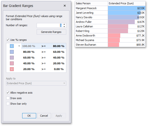
This dialog allows you to change the following options specific to Bar Gradient Ranges.
-
Number of ranges allows you to specify the number of ranges used to classify values.
-
Click the Generate Ranges button to generate a new gradient scale according to the specified number of ranges. The Use % ranges check box specifies whether the percent or absolute scale is used to generate ranges.
Note that this option is not available for numeric dimensions.
To change the specific color in the gradient, click the button next to the required color and select a new color or specify a custom background color. This allows you to create a color gradient based on more than two colors. In this case, the specified colors are marked with an empty square.
You can change range boundaries by specifying the required values.
Note that a new value should fall into a range between corresponding values of the previous and next range.
To change the comparison logic for the required range, click the comparison sign and select the required option.
The greater or equal sign includes the smallest value in the current interval while the greater sign excludes the smallest value from the current interval and includes it in the next interval.
Coloring
The Dashboard Designer provides the capability to manage coloring of dashboard item elements. You can choose whether to use a global color scheme providing consistent colors for identical values across the dashboard or a local color scheme that provides an independent set of colors for each dashboard item. The Dashboard Designer also allows you to edit colors automatically assigned from the default palette.
Coloring Concepts
The Dashboard Designer provides you with the capability to color dashboard item elements by associating dimension values/measures and specified colors. You can choose whether to use a global color scheme to provide consistent colors for identical values or specify a local color scheme for each dashboard item.
Supported Dashboard Items
The BI Dashboard allows you to manage coloring for the following dashboard items:
-
Chart
-
Scatter Chart
-
Pie
-
Pie Map
-
Range
-
Filter
-
Treemap
Color Schemes
The dashboard provides two ways of coloring dashboard item elements.
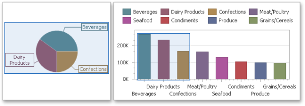
Using a global color scheme that provides consistent colors for identical values across the dashboard. The image below shows the dashboard containing Pie and Chart dashboard items. Pie segments and chart series points corresponding to 'Beverages', 'Condiments' and 'Diary Products' dimension values are colored using identical colors from the default palette.
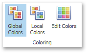
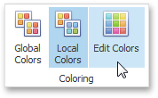
To use global colors for coloring dashboard item elements, click the Global Colors button in the Design ribbon tab.
When a global color scheme is used, the dashboard reserves automatically generated colors for certain values regardless of the filter state.
Using a local color scheme that provides an independent set of colors for each dashboard item.
To use local colors for coloring dashboard item elements, click Local Colors in the Design ribbon tab.
When a local color scheme is used, the dashboard reassigns palette colors when the filter state is changed.
Coloring Dimensions and Measures
Dashboard items allow you to manage the coloring of individual dimensions or all dashboard item measures using predefined coloring modes.
| Coloring Mode | Description |
|
Default |
Dimension values/measures are colored by default. To learn how specific dashboard items color their elements by default, see the Coloring topic for the corresponding dashboard item. |
|
Hue |
Dimension values/measures are colored by hue. If coloring by hue is enabled, a data item indicates this using the indicator. |
|
None |
Dimension values/measures are colored with the same color. |
Coloring Dimension Values
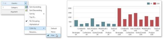
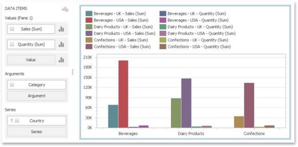
To specify the coloring mode for the required dimension, click the dimension's menu button and use the Color by sub-menu. For instance, the image below shows the Chart dashboard item whose 'Country' dimension is colored by hue.
Coloring Measures
To specify the coloring mode for dashboard item measures, click the menu button of any measure and use the Color by sub-menu. For instance, the image below shows the Pie dashboard item whose measures are colored by hue.
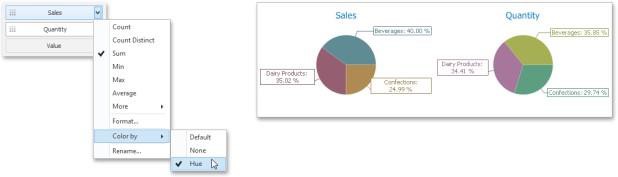
If you enabled coloring by hue for several dimensions/measures, all combinations of dimension values/measures will be automatically colored using different colors from the default palette.
Customizing a Color Scheme
The Dashboard Designer provides the capability to edit colors contained in global and local color schemes. You can select the required color from the default dashboard palette or specify a custom color.
Invoke a Color Scheme Dialog
To edit colors, use the Color Scheme dialog. You can invoke this dialog in the following ways:
To edit colors in a global color scheme, use the Edit Colors button in the Home ribbon tab or the Edit Colors button in the dashboard item's Design tab.
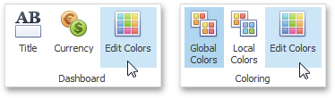
To edit colors in a local color scheme, use the Edit Colors button in the contextual Design ribbon tab.
Lets consider a Chart dashboard item whose dimensions and measures are colored by hue using local colors.
For this dashboard item, the Color Scheme dialog will contain combinations of all dimension values and a specific measure.
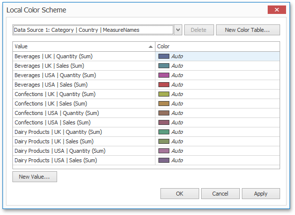
In this dialog, you can perform the following actions:
-
Edit automatically assigned colors or specify new colors.
-
Add new values to a color table.
-
Add new color tables containing values whose colors are not yet assigned.
Edit Colors
You can customize automatically assigned colors in several ways.
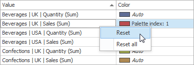
To retain the automatically assigned color for the selected value, right-click the required value in the Value column and select Retain this color.
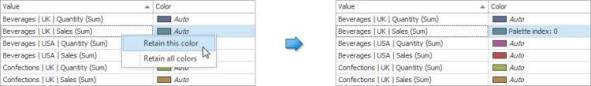
This reserves the current palette color for the selected value.
You can select another palette color by clicking the required cell in the Color column.
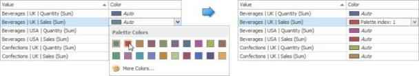
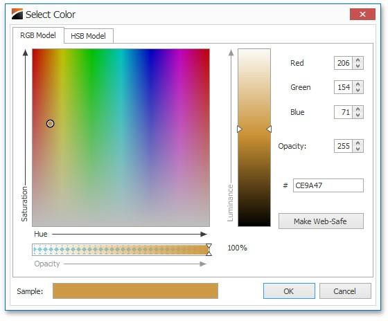
To specify a custom color, click More Colors... and pick any color using the RGB or HSB color model in the invoked Select Color dialog.
You can reset the customized color for the selected value using the Reset menu item.
Add a New Value
The Color Scheme dialog allows you adding a new value with the specified color to the selected color table. To do this, click the New Value... button.
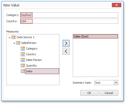
In the invoked New Value dialog, specify the dimension values, add the required measures and click OK. This creates a new value whose color can be specified as described in Edit Colors.
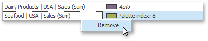
You can remove manually added values using the Remove context menu item.
Add a New Color Table
The Color Scheme dialog also allows you to add a new color table containing values whose colors are not yet assigned. To do this, click New Color Table... button.
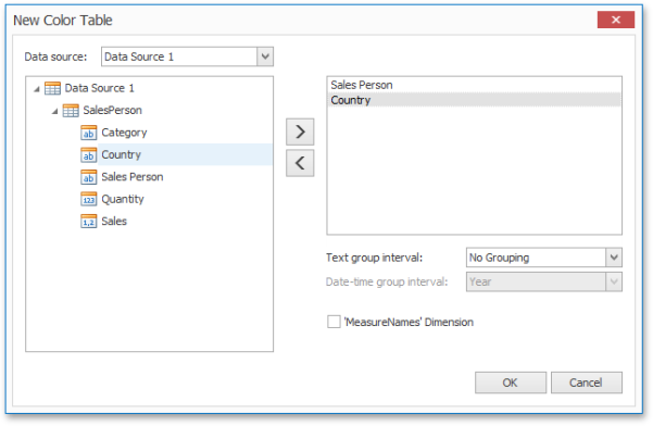
In the invoked dialog, specify the data source, add the required dimensions and enable the 'MeasureNames' Dimension check-box if you need to add measures to a color table.
Click OK to add the color table to a color scheme. Then, you can add values to this table (see Add a New Value) and specify its colors (see Edit Colors).


